Project 4 – Exercise 3 – Visual conventions for time and place

Examples of different visual conventions used to convey time and/or place/space

As part of my everyday life, I often have to track down reference material, data or information that may take many varied forms and sits behind several disparate descriptions and names. Understanding Boolean logic functions enables highly focussed searching (I can search for a specific term or file and even restrict this to a single domain or sub-section of a site). You can often travel ‘down the rabbit hole’ and this (and the attendant adjustment to search terms) brings further results, e.g. moving from describing what something is or does, to finding out the specific name or term for that thing.

Frame by Frame Storytelling:

Often in the form of a comic strip or graphic novel, the examples that follow span one and a half centuries. The way that speech is handled may differ and the content may have become more permissive, but sequential images are used from light hearted fun to current storyboarding for films; a key tool in discussions between technical roles in film making.

Image result for Rodolphe Töpffer, Histoire de M. Vieux Bois

Rodolphe Töpffer, Histoire de M. Vieux Bois Created 1827 (published 1837)

Regarding the image above and below, it is possible to also note the change in the way that speech in ‘cartoons’ has been handled. Older cartoons did not make significant use of the type of speech and thought bubble that we are used to today.

Image result for bloodrunners

Andy Sparrow, BLOODRUNNERS, c.1987

Jeff Errico, Storyboard Snow White and the Huntsman, 2011


The Use of Perspective:

Perspective in art conventions has not only varied throughout time, but also has cultural links. What we think of as traditional Western Europoean art has an accepted use of perspective – objects diminish in the distance, lines converge. Traditional Japanese art does not necessarily follow these precepts.

Image result for historic perspective in art

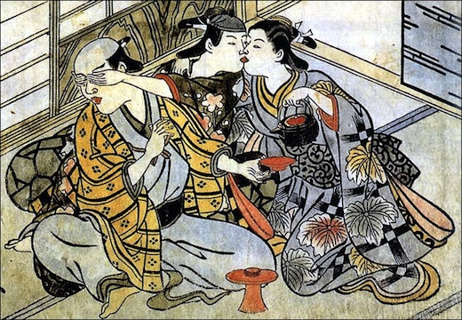
18th Century Japanese print (source: Wikimedia Commons)

The earliest Western Image considered to acknowledge rules of perspective is Lorenzetti’s Annunciation where the floor tiles are diminishing to a single point.

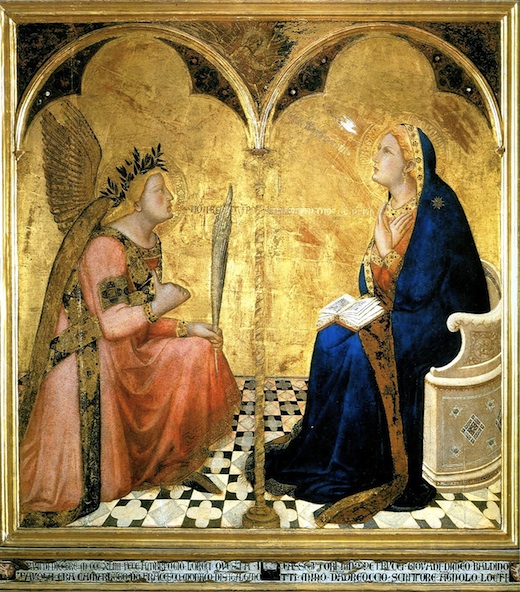
Ambrogio Lorenzetti, Annunciation, 1344 Source: Wikimedia Commons

Burne Hogarth, meanwhile, made heavy use of perspective to increase visual tension and a sense of dynamism in his strip art and drawings.

Image result for burne hogarth dynamic figure drawing

Perspective may be forced, to create misleading, but interesting and fun viewpoints…

Image result for forced perspective

…or perspective can be ignored, or repeated, as in the cubist’s multiple points of view being represented at any one time, as in Gris’ The Guitar. As an occasional musician, I feel that this captures the feeling of an acoustic guitar well.

Juan Gris, The Guitar, 1918 (source: Wikimedia Commons)


On reflection:

The evolution of visual conventions does, it appears, remain contemporary with their period and social structures and state. As culture changes, so do visual conventions. As media changes, this too is mirrored in convention change, possibly in response to expectations or perhaps as the catalyst for change itself.

I have discovered that I have an intolerance of slow searches that do not react well to logic statements in searches. I consistently return to Google, as I am able to drive that in a way that generates good initial results and is also easy to refine if needs be. VADS gives acceptable results, but it is painfully slow in comparison to find what I am seeking. I’m sure that this will not always be so, but sometime separating the wheat from the chaff results in my returning to the big G.

Project 4 – Exercise 2 – Knitting patterns

We have been asked to produce a quick mind map of what knitting means to us and what we associate with it. So here, in all its unedited glory is just that – my quick mind map:

It’s honest and unpolished – this is meant to be a learning log, after all…! To give a little in the way of context, I grew up with a mother that could knit, do it well and do it quickly. To the best of my memory, I have always had knitwear round and seen patterns. Some of the associations above may appear odd, but there is always a reason.

How knitting has been represented

Image result for knitting history

Knitting for victory WW1 One million socks…

As a social duty: Creating clothing as part of a cause, in the case aboe, to make and send clothing to troops in the trenches.


Image result for knitting history

In traditional Welsh dress

As a cultural heritage. Traditionally dressed Welsh women knitting. Oddly, the women do not often seem to actually wear knitted clothing.


Image result for knitting history

Image by Jean Patchett for Knitting Magazine

Image result for knitting history

As aspirational glamour. Kntwear has, at various times, been on-trend in fashion apparently (I’m a jeans and tee person – really underqualified to comment!). Like a lot of trends, this is cyclical. I have no awareness of where we are in the sine wave of fashion right now.


Image result for knitting history

Image result for knitting history

Tradition for men. Particularly in the North East of the UK, Northumbria and the North Riding of Yorkshire, men were the knitters. Probably out of necessity, but also perhaps as something that could be done by candelight that didn’t result in babies! This is a tradition that has died out in more recent generations.


Image result for knitting 1970s

It may have been fashion, but the 1970s have A LOT to answer for. Both the items and the style are very much of their period.


Image result for knitting 1970s

For that Norman invader look. Just because you can, doesn’t mean you should.


Image result for knitting 1970s

A WTF moment. This looks more like the siblings and the men wanted for their murder than a promotional pattern. If Quentin Tarrentino sees this image, there’ll be a film at the end of it.

Image result for funny knitting

Cats on the web are something of a new media phenomenon. it was only a matter of time before they were mixed with knitting (although the rumoured humerous tank top card is largely notable by its lack of visibility).

Image result for funny knitting

A new take on knitting with new technology


Image result for sex knitted


Even frisky knits exist and are more visible with modern mass media.


Image result for contemporary knitting

Image result for contemporary knitting

Contemporary high fashion knits can be heavily structural in how they are made, but the portrayal is more creative and thought out in a graphic or a high-fashion manner.


File:Ibarra (Aramayona), yarn bombing 2.JPG

File:Ffm traxler statue elche mit guerilla-knitting.jpg

File:Un Ponte di Lana.jpg

Yarnbombing can be a way of recapturing sterile or overly clinical public spaces. But somethimes it can be as a commentary on the surroundings in a far more playful way. The final image above reflects the colours of the houses and boats in the background and is nore gentle as a result.


Reflection on these images (and the searches).

What is clear from all the viewing of images on the web is how much association with women there is in all knitting images. Is this merely a reflection of society, or does it reinforce stereotypes? In addition, the majority would show the knitters to be older women (though not by the margin that may have been expected). This very definitely fits in with the stereotype of knitting being an older woman’s pasttime.

Contemporary images are finally moving away from this premise, as knitting is welcomed into the arms of textile arts. many images are more playful and see it as an art or high craft, rather than a neccessity for coping with austerity.

How closely this aligns with my associations is a debatable point. Certainly from the craft, the warmth, the tradition PoV, there is some similarity. But, I suspect that my familiarity with knitting being around me (literally so, often) has given me a unique perspective and meant that some of teh most common preconceptons are not shared by me.

Project 4 – Exercise 1 – The next big thing

Not being at the cutting edge of ‘wider contemporary trends’, I found choosing an example of contemporary visual communication… challenging. So I resorted to the British Design and Art Direction website https://www.dandad.org to see what I could find

Alien Advert for Volkswagon.

“Brief:
To promote Volkswagen’s longstanding support of independent cinemas, we created a series of light-hearted cinematic films set in different movie genres. ‘Alien’ shows Volkswagen’s innovative technology take a starring role as its Hands Free Boot Opening comically breaks the intended suspense. Although perfect for real life, it’s not made for Hollywood”

https://www.dandad.org/awards/professional/2017/film-advertising/26108/alien Accessed 24/08/2017

The advert makes use of cutting edge computer generated graphics and references contemporary cinema in both cinematic style and thematically, making it (at the time of release) a very ‘now’ advert. The protagonists run for the safety of their car, through high contrast, stark sets. The monster, the antagonist follows them, only to lose them as they hide in the boot of the car. The car, and its under bumper sensor, joins the monster as an antagonist by repeatedly opening as the creature’s tail swings underneath it. In fact, it follows the hero’s journey to a point, with the humour being imarted by the lack of closure (sic) for the full narrative arc.The connotation being that VWs are safe and secure, reliable, but fun.

Ignoring the subject, the external referencing is the most likely factor to make this ‘last year’s thing’. As cinematic style alters, the overall look will become passé. As horror references change and move, the same effect will be observed. Technology itself will change, making the antagonist as dated as Ray Harryhausen’s stop motion creations (although they will always have a certain charm). Technology will improve, but this type of advert, which waves a flag to show VolksWagen’s support for independant cinema, will follow the media that it is promoting.

It is too easy to look to the visually impressive and forget the everyday examples of visual communication. Such an overlooked article may be the implementation of electronic labelling. This has to carry identification and be able to deliver an unambiguous message to the reader.

Image result for tesco electronic price label

This is another case where the media is the message. As the nature of the technology improves and the ability to provide a more complext graphic interface changes, the communication itself will fall into line. e.g. Very shortly (in reference to Point of Purchase design), the black and grey graphics will be superseded by colour, sharper graphics, movement etc.

Project 3 – Exercise 2 – Join The Navy

Image result for join the navy poster

Richard Fayerweather Babcock, Join The Navy, 1917

Denotation:

The poster is split into two parts, with image above and text below.

The upper partshows a young  enlisted sailor riding on the back of an orange torpedo, travelling upper right right to lower left. He is holding on with his left hand clasping reigns and his right hand raised above his head with a short length of rope, apparently being used as a whip.

The torpedo is speeding along the top of a dark green sea (although, applying a white balance to the image, this apparently returns to a deep blue-green), with spray coming from the bottom of the ‘hull’ and from the propellor at the rear. This and the rear of the sailor’s collar suggest speed.

‘JOIN THE NAVY’ is in bold red text, with two waving lines under the smaller word ‘THE’. The sub-heading text of ‘THE SERVICE FOR FIGHTING MEN’ is in smaller lettering and in black, the last two words being slightly larger. All the text is signwritten, as opposed to using a typeface

Connotation:

There is an overal visceral nature to the image. Disregarding any modern connotation of the torpedo as a phallic symbol might be premature. Sailors have always had something of a bawdy reputation and this poster alludes to it – not just in the torpedo that is barely being controlled by the sailor, but also in the text.

However, this control supports another reading of the torpedo: as bucking bronco or wild horse. The position of the sailor riding it is much like that of a rodeo cowboy – another macho icon. This is manliness and power being shown and could be viewed as a challenge: are you man enough? In fact, ‘THE SERVICE FOR FIGHTING MEN’ is clearly implying that they are expecting men that enjoy getting into a scrap. The sailor is even whipping the torpedo to make it go faster.

This poster is, in fact, selling excitement and manliness, not recruitment.

Basic colour corrected version


Semiotic analysis of another Image

It is difficult to know how to choose an image to analyse. In the end, I let random chance help me select one. Almost random, in that I closed my eyes and poked my finger towards the screen of a Google search with the text string ‘advertising posters’

Related image

Denotation:

The image is one of a black background with an incandescent bulb (unlit) half-filled with water and having a green shoot, presumably from a tea plant, breaking through to the outside. The headline below readsL LIGHTS in white, OFF in grey and GREEN ON in green.The copy below states that it is a reminder to support Earth Hour, where lights are turned off for one hour.

Connotation:

The lower part of the bulb may not, in fact, be filled with water, but perhaps has become water. Water here is the sustainer and giver of life. This is juxtaposed with the incandescent bulb, which is a heavy user of energy. The green shoot coming from the water is young and fragile and the message is ‘protect me’

The colouring of the title letters is an instruction:

LIGHTS in white: the light are on

OFF in grey: turn them off for a short while

GREEN ON in green: help the environment and sustainability.

The black background signifies that it is the darkness, without artificail light, that is encapsulating the nature of the change.

Of course, this is my perspective and as such it will be my reading of this image only. Whilst we may attempt to sideline our own viewpoints and be as objective as possible, we are the product of our experiences and environment and this will always colour our perception. Read Terry Pratchett’s Dark Side of the Sun for an interesting take on this.

Project 3 – Exercise 1 – What does this apple mean?

Investigating apples as a signifier in images.

Related image

René Magritte, The Son of Man, 1964

Here we have apples as the antagonist, an agent of conflict.

“it hides the face partly. Well, so you have the apparent face, the apple, hiding the visible but hidden, the face of the person. It’s something that happens constantly. Everything we see hides another thing, we always want to see what is hidden by what we see. There is an interest in that which is hidden and which the visible does not show us. This interest can take the form of a quite intense feeling, a sort of conflict, one might say, between the visible that is hidden and the visible that is present.”

Image result for advertisement eating apples

The apple here is clearly a signifier of health and wellbeing. The model is a shining example of healthiness in advacing years, mirrored by the perfection of the apple. The apple is vitality and youth.


Image result for adam and eve apple

The apple as a sexual metaphor. This is the biblical apple of temptation, of forbidden knowledge from forbidden fruit. Apples are often used as an item of temptation, such as Melanion usin three golden apples to distract Atalanta

File:Guido Reni - Atalanta e Ippomene (Napoli).jpg

Atalanta and Melanion, Guido Reni, c. 1622–25


Reflection:

The apple seems to have something of a split personality in art. It is both the signifier of health and vitality, but also of temptation and knowledge. Arguably, the latter is from biblical references cascading down through the centuries.

In summary. the apple’s key signifiers are:

Health

Knowledge

Temptation

Project 2 – Exercise 3 – Film Posters

We have been asked to choose a film and its corresponding poster and reflect on how the typography, image, colour and composition are used to reflect the nature of the film.

It was a close run thing between this and Alien, but it has (for me) to be:

https://i.pinimg.com/736x/f1/84/66/f18466a7a69f22d678388adc9e3e4ef6--jaws-movie-poster-original-movie-posters.jpg

The overall graphic of the poster leaves you in no doubt as to who the real star of the film is, and my what big teeth it has! The shark is looming out of the darkest depths, completely unbeknownst to the oblivious swimmer above. This sets an undercurrent of terror. What else is waiting? When will it attack? It is an anticipation of fear that is almost second to none. The shark has a dead-eyed malevolence to it and this is underscored by the use of blue tones throughout the lower portion of the poster. Blue is associated with cold, dark and eerie.

The pink of the scantily clad swimmer may be considered titillation (not exactly uncommon in the 1970s). An alternative interpretation might suggest that the pink hues provide subconscious cues to vitality and energy – being full of life.

The condensed, bold text of the title brings a burst of colour into a deliberately light background (which provides contrast to the blue of the ocean below too). This block of text is red, clearly alluding to the colour of blood.

At the top of the poster we see the word emblazened ” JAWS “, whilst mirroring it at the bottom of the poster we see the jaws themselves. This provides a visual symmetry to the poster.

The remaining typography is simple and unfussy, because the statement is already made. The co-stars have good billing in a black on white font and the production information is presented in a white on dark blue – contrast being key to maintain legibility.

The terrifying motion picture from the terrifying No.1 best seller ” text underlines the visual communication – you’re going to get the pants scared off of you! The font has probably been chosen to resemble the printed text of the book, rather TNR in format.

All in all, a beautifully unsettling exercise in promotional posters.

Project 2 – Exercise 2 – Re-contextualising Images

I have to note that I had not seen (or knowingly seen, at least) John Heartfield’s work before I created my re-contextualised image. Sometimes I do things arse about face – what can I say???

This is my response to Trumps rhetoric after the clashes between people and white supremecists/Nazis at the Charlottesville rally.

There can never be and excuse for them. Racism is a repugnent and ignorant viewpoint, end of story. Trump showing his colours, I feel.

Click to resize.

It is alarming, not just the rhetoric of Trump, but the stance that has echoes of Hitler. More frightening is the apparent quantity of people that share the ‘alt-right’ view and how it can be received as being in any way  acceptable. We stand on the shoulders of giants. Some people choose to stand on the shoulders of evil…

The image deliberately includes the Swastika and the roundel with bars seen on Nazi flags. The stars and strips echo the banners in the colourised Nuremberg rally image and the stars eco the helmets of the German troops.

This is a sketch, rather than a completed piece. I may return to it. I think that it has the kernel of achieving what I want to say, but it would warrant further development.

Project 2 – Exercise 1 – Mixed Messages

What kind of messages are the statements below sending? Describe what is being communicated through the combination of what they say and the visual feel of the typography.

Clearly aimed at some form of visitor (you wouldn’t say this as a landlord to a tenant, or you shouldn’t do, at least), the use of a gothic font suggest that a sense of age or history is being implied. It suggests Middle England, half timbered houses and castles. Lucida Blackletter, possibly.

At first clance, a normal serif (tops and tails to letters) typeface that is a somewhat dry warning not to, well, give food to the animals. However, looking closer we see that it actually has a much more playful shape to the letters:

Very Bedknobs and Broomsticks. I would infer from this that the notice is aimed at pre-teens, but not the very young (crocodiles at a petting zoo? Maybe not…). Looks a bit like Chaz, but tweaked.

Another serif font, it avoids being austere by the use of line width variance and a softer, non-uniform curve. “We are professionals, but we are approachable” is my impression. This might be a version of Artigo, but then again, it may not.

Screaming Roman oppulence, this font wants you to know that its minimum thread count is more than 300. Herculanum, at a guess.


Project 1 – Exercise 1 – Identifying visual communications

Visual communications tend to be driven by a specific purpose. For this exercise, the following are being considered, with examples below: 1. Persuasion (aiming to
convince, entice or direct the viewer for commercial, political or social ends); 2. Information (delivering information or content in some way); 3. Identity Design (creating a particular emotive response or association with a brand identity, logo or other visual identity); 4.Authorial Content (generating new and engaging content through comics, graphic novels, animations and other media); 5. Interactive Design (interactive communications offer users the opportunity to get visual feedback, contribute content or simply feel a part of something); 6. Alternative Messages (used as a subcultural and grassroots tool for protest, creating identities or creating alternative ways of communicating – subversion and appropriation).

1. Persuasion:

This famous advert also appropriates Phil Collins’ original piece and even his manerisms. What has a drumming gorilla have to do with chocolate? The media is the message.

https://vimeo.com/62839747 Accessed 21/08/2017

Image result for movie posters

One of the most iconic movie posters of all time. It is selling fear at a visceral level

http://www.ebay.co.uk/gds/Top-10-Movie-Posters-/10000000204976273/g.html Accessed 21/08/201717

Image result for adverts

Possibly breaching most current advertising standards and an arguable final comment (i like it, but it has given us a phrase for polarised opinion)

https://www.pinterest.co.uk/pin/427349452112385722/ Accessed 21/08/2017

2. Information

Poster change instructions (the sign itself, its name and the instruction set was designed by me something over ten years ago – it is  still in production).

Image result for projection symbol

Technical drawing projection symbol, allows users of drawings to understand from which direction a view is seen. This shows third angle projection.

Image result for toilet symbol

Almost universal sign for toilets. Which reminds me…..


3. Identity Design

Image result for Identity Design Examples

An example of ‘what were they thinking?!’ The orignal Spotify Logo ident is awful on so many levels. There is an effect going on that makes you want to call it Spootify…

AirBNB branding has become instantly recognisable. The connectivity suggested by the logo is clear

Image result for coke branding

Oh, come on. Possibly the most well known branding there is. It would have been rude not to include it!


4. Authorial Content

Image result for dark knight returns

DC Comics The Dark Knight Returns. This one frme from the graphic novel sums up the tone of the work.

Roger Ramjet. Of its time and off its rocker, but very, VERY sixties.

Image result for halo

The Halo game universe has to be included as part of this section. Scripted somewhat, but highly visual and famous for it.


5. Interactive Design

Image result for facebook quizzes

Facebook quizes. Draw them in, harvest their data, everybody’s happy. Cynical? Moi?

Image result for ATM front screen

ATMs may be multilingual and benefit from great visual communication.

Image result for webpage menu

Webpages and especially menus. Simple can really be best here, as consumers are known to have low threshholds of bor…………


6. Alternative Messages

Image result for subverted graphic messages

Quite brutal in its accusation

Image result for subverted graphic messages

The flipside of that iconic image

Related image

From the London anti-trump protest.


All of these images and visual communication methds build on what has gone before. Essentially, visual cmmunication is a constantly changing discipline that remains in an ongoing and nver ceasing state of flux due to changes in society, technology and a permanently flexible set of referene points. It is almost living, in its nature.

Research Point – Whitney Davis – Communication Theory

Communication is a communicative act between 2 or more parties

Jakobson’s analysis of communications has six factors of communication: ‘the addresser, addressee, message, code, context and contact’.

Intent is key to reliable communication from addresser to addressee.

Intent is usually informed by a shared perspective and ability to contextualise correctly.